UI Challenge 004: Calculator
Think about a calculator. How do you want it to function? What kind of features do you want it to have? Have you ever considered these thoughts before?
A calculator seems to basic, but when faced with task to redesign it – considering its functionality and what it is for (a phone, a tablet, a web app) – the question becomes so much more complicated.
This was my task for my 4th UI challenge.
For a second I had to think about calculators in general and what I typically use the calculator on my phone/laptop for.
Back in secondary school I remember I was super excited when I was in a math class that required a graphing calculator – the fact that I could finally have one was a big day!
Of course many of the kids in my class learned how to use it as a sort of crude “drawing” tool as well, which I promptly tried to figure out as well. But in general I was so excited to finally be able to graduate from the paper to a cool “digital device”. I was always that kid fascinated by tech and wanting to have the latest and greatest thing.
Alas...In order to actually get a cellphone I had to first be 16-years-old with a job, and second, my friend and I had to actually create poster board presentations and present them to our parents after tennis practice in order to convince them we really did need cell phones. Spoiler alert: We succeeded, and I received my first (cute, little brick) Nokia which had the upgraded version of Snake!
But back to the calculator….
It’s been a long time since I’ve used one, and many times I whip out the one on my phone when I need to calculate a tip at a restaurant or cafe. But other times when I desperately need an easy way to do calculations and convert numbers is when I am cooking and/or baking. Which is something I do on a daily basis.
So many of the recipes I find for either savory or sweet dishes are from countries outside the US, therefore are written in measurements (or in temperatures) I am not well versed in. And that is when I had a thought...
When this calculator Daily UI challenge arrived in my inbox – with the parameters that I needed to consider whether or not my calculator would be standard, scientific, or specialty for something such as a mortgage, for a phone, tablet, web app, etc. – I thought about my daily needs and knew exactly what I needed to design.
My mission: To create a calculator – keeping in mind whether or not it would be standard, scientific, or specialty calculator (for something such as a mortgage). As well as thinking about the device the calculator would function on. Is it for a phone, a tablet, a web app, etc.?
The user(s): Millennial females who need to do basic calculations to include tip when they are out for dinner, brunch and/or drinks with their friends; as well as when they need to convert measurements during their weekly baking/cooking adventures.
The problem: Users hate having to resort to do a longer calculation on their phone just to figure out the tip for their portion of a bill, and also get tired of resorting to a Google search in order to convert baking/cooking measurements when they are referencing a recipe from another country.
My solution: A standard calculator, which features all of the basic arithmetic functions, the ability to “turn on” more specialty functions within a settings menu, and the ability to integrate a baking calculator for the pesky conversions so many users need at the drop of a hat.
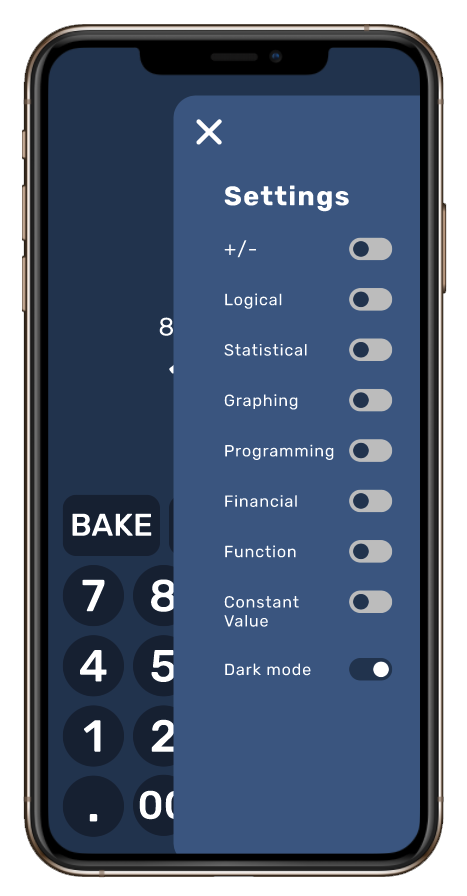
Additionally, an additional feature includes the option for users to switch between light and dark mode – via a “Sunrise” and “Sunset” mode toggle.
Where do we hold our phones?
Because I decided to design a mobile version of the calculator I had to consider how the user actually holds their phone (no matter the operating system or size of the device) in their hands.
Luckily, this was the entire focus of one of my General Assembly’s lessons in my UXDI (User Experience Design Immersive) bootcamp.
Before even putting pencil to paper I needed to:
Define the various touch gestures and how they are commonly used
Recognize and apply common mobile design patterns, and
Explore approaches to designing for mobile – particularly when overlays are used
“Mobile-first” means “content-first”
Because I knew my calculator would be a mobile-first app, already downloaded on a user’s device (I focused on iOS), I was forced to consider and design for:
What my users appreciate the most?
What is most important for my users to do?
And, what is the core competency of my calculator?
In a nutshell:
My users appreciate the ability to quickly perform basic arithmetic functions – particularly calculating tip – quickly
My users must be able to convert baking/cooking measurements from “foreign recipes”
And my users must be able to perform 4 basic core competencies:
Interpret: Explain recipe ingredients presented in local mathematical forms (e.g., Metric and Imperial measurements, temperatures in their local scale)
Representation: Convert relevant information into various local mathematical forms (e.g., equations, geometrical figures)
Calculation: Correctly solve mathematical representation using appropriate arithmetic, algebraic, geometric, logical and/or statistical methods (depending on the settings applied)
Application / Analysis: Make judgments and draw appropriate conclusions (e.g. the correct baking and cooking measurements for their location) based on the quantitative analysis of data, while recognizing the limits of this analysis
How we hold our phones
The following diagram is something I received from General Assembly (which I recreated due to the initial quality) and have referenced over and over again when designing for mobile, because it is widely known that any “target” on a screen (e.g. what the user will be pressing) needs to be usable for fingertips, these “targets” need to be either rectangular and circular, and need to be at least a 40px hit target with 10–20px between them.
After making sure the above heat map was burned into my brain I set to work on initial sketches that would inform my mid-fidelity wireframe just to make sure everything was laid out correctly – I also tested this initial design on my sister.
When it came to the design of the basic calculator I included the functions most used by users on both their smartphones and smartwatches – basic arithmetic and a tip function.
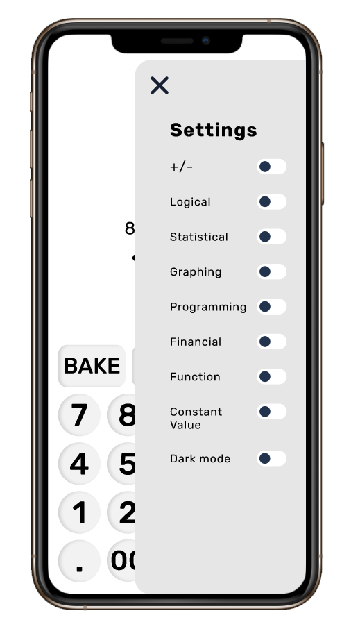
If users were looking for more advanced features, such as being able to perform statistical or graphing calculations, as well as the ability to choose the display mode of their calculator, I placed these toggle options within a settings menu.
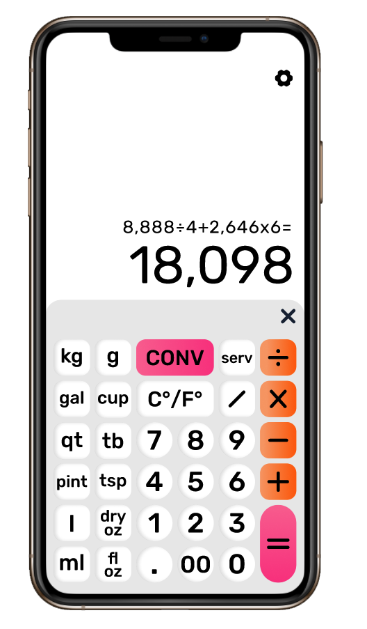
Because one of my main concerns was solving for the user who is also an avid baker I included a “BAKE” button within the basic calculator display, allowing users to tap the button to open a more advanced baking calculator overlay.
This calculator included features allowing users to convert ingredient measurements, switch between Celsius and Fahrenheit temperatures, perform basic arithmetic, and calculate dry and wet ingredients.
Thinking about light vs dark mode
Now I am someone who prefers light mode. There’s just something happier and more upbeat (in my opinion) about your phone screen being in a brighter color.
That being said, with the release of dark mode within the past couple of years so many users gravitated toward a dark, richer and “more calming” phone display.
Because of this, I knew that I needed to consider both a light and a dark mode solution for my calculator – ultimately giving the user the option to choose their experience, rather than determining it for them.
Enter Sunset (aka Dark) Mode
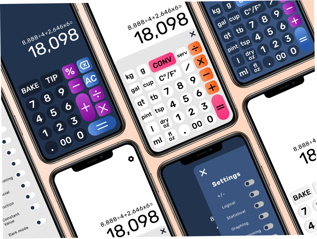
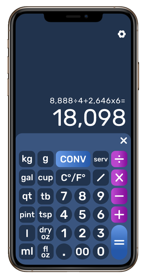
I modeled this mode of the calculator after cooler, sunset colors and the night sky – e.g. why I named this mode “Sunset Mode”.
I carried this color theme through the baking calculator as well – designing the number buttons to than on a darker tint than the background of the calculator, with the main calculation buttons (including add, minus, divide, multiply, etc.) to feature the “sunset” colors of purple and blue.

Enter Sunrise (aka Light) Mode
This mode of the calculator was modeled after the warmer, sunrise tones of white, orange and pink – the reasoning behind naming the mode “Sunrise Mode”.
Similar to the Sunset Mode, these colors were carried into the baking calculator as well – with the number buttons featuring a slightly grey tint to separate them from the white background of the calculator, and the main calculation buttons (including add, minus, divide, multiply, etc.) featuring the “sunrise” colors of orange and pink.

